Sherwin Williams 2026 Color of the Year!
Let’s just start by saying…this is not the ‘Color of the Year’ that’s filled with drama and contention! *ahem-Pantone-ahem*
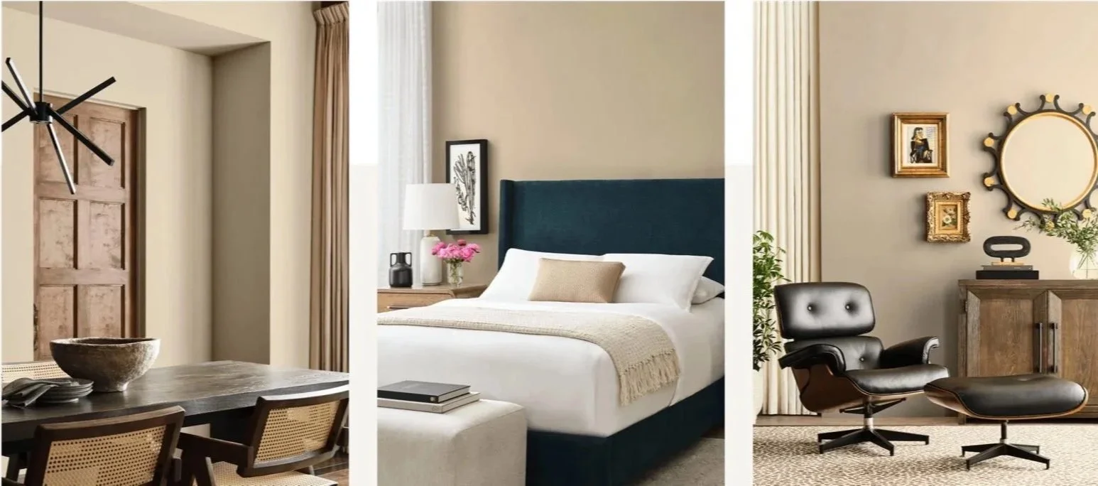
It IS, however the ‘Color of the Year’ that’s filled with a knockout paint color…in other words: Universal Khaki from Sherwin Williams!
Sherwin described the choice as a “beautiful balance of livability and longevity” and we agree! You really can’t go wrong in choosing a room in your house to paint in this color selection. It’s universally (wink) an attractive choice. While it’s a neutral that works in just about every space you can imagine, it’s also not “too trendy.” In other words, it’s not a paint selection that will be gone in the next few years. We’ve seen a lot of those in our time in the paint industry and, in our humble opinion, this ain’t that.
It’s a warmer neutral and one that would coordinate beautifully with shades of blue. In fact, it would work with a variety of options from the blue color spectrum. You could go with a navy hue as well as a softer “beach-y” blue, which you could incorporate through fabric decor (pillows, drapes, rugs, etc.) or furniture (arm chairs or painted end tables) or smaller decorative touches that pull a room together (art, lamps, and the like.) If you need a little blue-spiration, some of our matchups would be Tidewater, Inky Blue, and Anchors Away.
On a practical note: we steer our clients away from painting according to trends…because, well, the trends…they be fickle. That’s honestly the beauty of neutral paint colors, however. If you’re a maximalist, you can dress up a neutral with design layers—e.g. pairing a neutral color with a bolder wall paper. And if you’re a minimalist, neutral just makes sense.
And this one is a neutral that is cozy and warm and rich—a winning selection for this year's COTY!